


Overview
Whir is a community-based app facilitating transparent deals and events for local businesses, fostering easier interaction with residents. Their primary goal is community re-engagement, countering the convenience-driven trend of delivery apps. Whir aims to reignite local interaction and support small businesses.
Project Details
Role
Team Lead, UX/UI Designer
Duration
8 weeks
Tools
Figma, Jira, Slack, Google Meet
Problem
The product owner partnered with a developer and conceptualized the app’s design idea. Whir's team needed support empathizing with an audience of users who prefer local experiences with different types of businesses rather than big names. They didn't conduct foundational research or implement design thinking principles in their MVP.


Solution
As the team lead, I identified key user needs and preferences based on the client’s briefing. I prioritized conducting foundational research on current design structures and competitive analysis to understand how to position and find the product's added value. As a team, we prioritized the client's needs and users' motivations when using community-based apps and implemented design thinking principles with a strong focus on user-centricity and consistency.
Getting to know the brand
During our kickoff call, we planned research on brand attributes, competitors, and current designs. The client identified mature UX brands as competitors, so the foundational research around the brand and design functionality was prioritized at this stage, starting with a blank canvas in the discovery stage. I completed a competitive analysis and heuristic evaluation and shared insights with the team to begin collecting UX/UI inspiration based on clients' priorities for functionality and UI.

Whir's Competitor Landscape
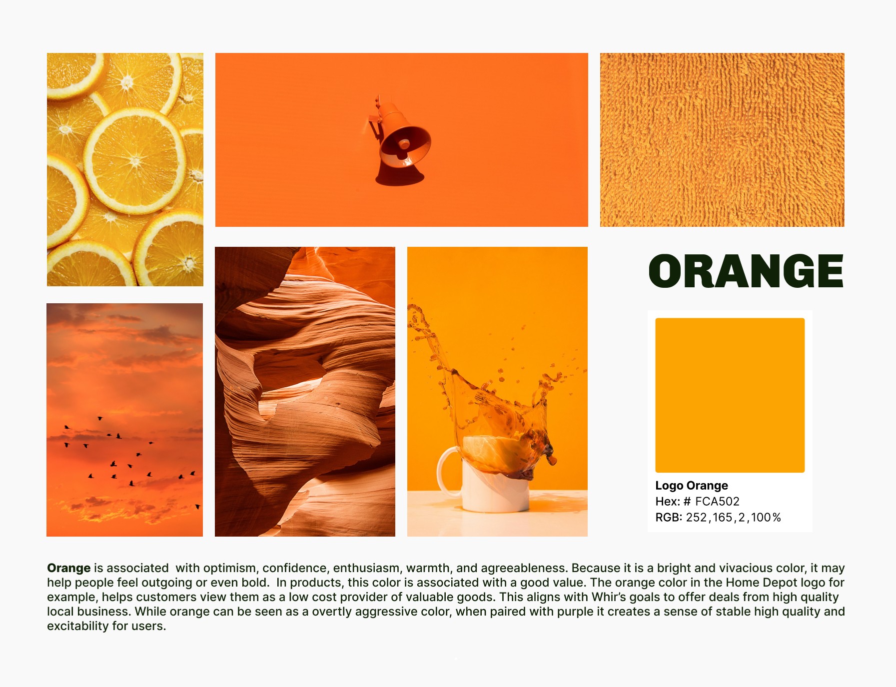
Having fun with bold color combinations
The research process was very fun. We learned a lot from heuristic evaluations, particularly about the lack of consistency across the design. In addition, as we looked at competitors and the client's brief, we learned how important it was for Whir's product owner to position the brand as fun, reliable, and approachable. With these in mind, we started gathering inspiration for color and UI.

Ideating a product with great potential
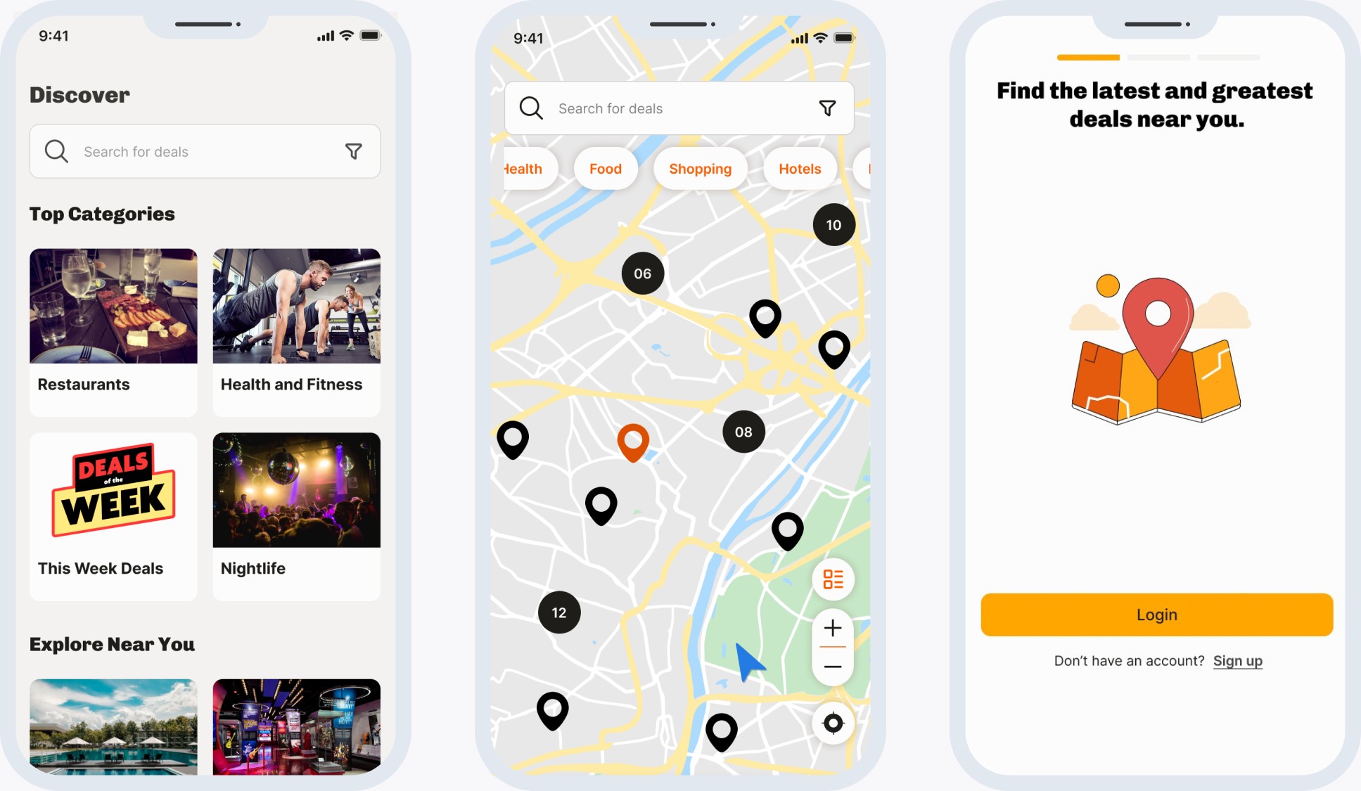
The product manager provided us with five user stories to redesign the Whir's app :
As a user, I want to create an account and log in.
As a user, I want to be able to navigate the map to find local points of interest near me.
As a user, I need the points of interest on the map, when selected, to display desired information.
As a user, I need to be able to navigate through a simple but charming page that displays deals near me so that I can browse and explore the offerings in my community.
As a user, I need my profile to reflect my taste in my community so that when I go there, I see all my favorite deals and businesses in one location.
.
I worked on userflow 1, 3, and 5 and designed low and medium-fidelity wireframes of the log-in experience, detailed pages for userflows 3 and 4, and profile and favorite pages for userflow 5.


Makeover time!
We iterated on the Dashboard screen. We decided this was ideal because:
The client must elaborate on details about Whir's experience and an overview of what to expect on other pages.
The client didn't have a Dashboard in their MVD.
I designed option 1, which the client selected as the final iteration. I was inspired by the brand's attributes and business mission.
The Whir Edu cards feature, a standout element in our design, was particularly favored by the client. This feature was not just aesthetically pleasing, but also served a crucial purpose. It was thoughtfully designed as a roadmap to empathize with new users and educate them about this new product, thereby enhancing the user onboarding experience.

Whir's first style guide
The style guide we created helped us understand how the high-fidelity screen would look and feel to the user and the consistency all screens needed to have—the color palette associated with the mood board's predominant shades and established branding attributes. I led the process of studying typography and selecting graphic designs. The font chosen was Inter for the body and Chivo for the headings; I wanted the user to experience a readable font to optimize accessibility.


Overcoming challenges, but we got high-fidelity wireframes!
In this process, I refined my work in previous medium fidelity wireframes with userflow 1, in which the user logs in and signs up for the first time. The user registers for the first time, navigating modal overlays with social login options. Once the verification steps are completed, users will have an anticipation screen with icons to label the navigation bar. This ensures users have an idea of the app's features.


The team struggled with time management, health inconveniences and holidays caught us during the project timeline. During daily stand-ups, I prioritized communication and looked for blockers to speed up deliverables. After setting up userflow 1, I worked on blockers in userflow 5 to refine the profile and favorite pages and the detailed page from userflow 4, in which users learn more about a place, explore recent deals, and read reviews.
Ready for dev mode
The developer handoff for the log-in and sign-up included measurements and annotations to guide implementation. The critical points for successful implementation included guidelines for overlay position, password recovery feedback, and success criteria in text fields.

Just with more time …
Whir's redesign saw a notable change in its color palette. Initially, a bold mix of orange and purple was crafted during the discovery stage to align with the brand's identity. However, the client later preferred a monochromatic approach during UI iterations. Despite my fondness for purple, I consciously set aside biases when implementing the client's choice. Reflecting on this, I see the need for a more robust rationale for retaining the purple accent. With more time, I would enhance collaboration with the design team to integrate UI elements from later iterations into earlier stages, focusing on the asymmetrical cards for deals from iteration number 3.

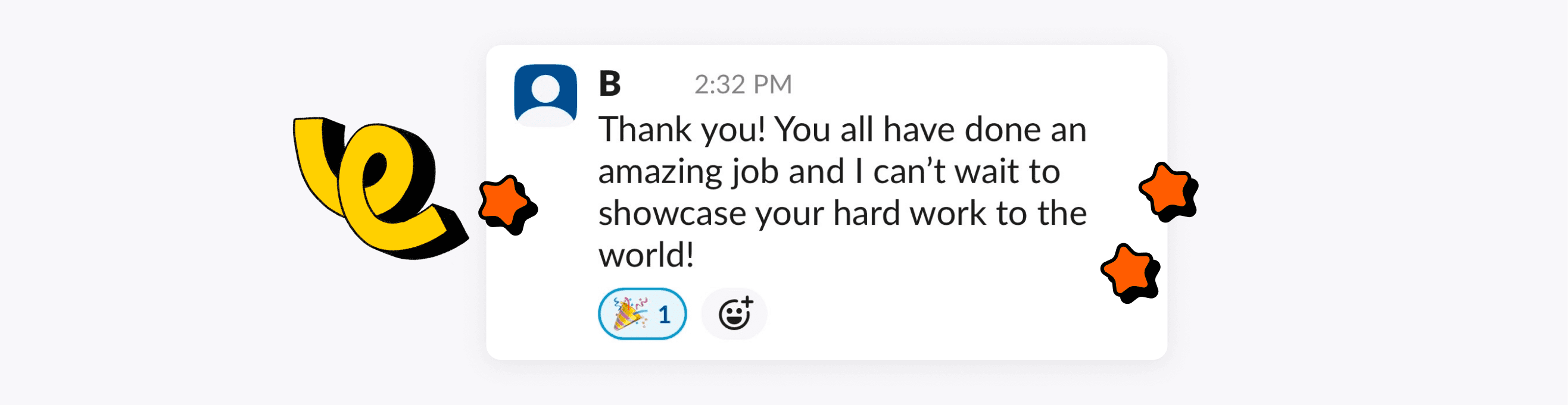
The client expressed his gratitude to the team: "Thank you! You all have done an amazing job, and I can’t wait to showcase your hard work to the world!”. The next step for Whir was to conduct A/B testing between their version of designs and ours. As for now, the client has decided to move forward with our version for a soft launch, and his co-founder will implement code based on handoff. I enjoyed how easy it was to communicate with the client. As a team leader, I felt my opinions and rationale behind design decisions were valuable for Whir's product owners. A suggestion for the client is to conduct usability testing to ensure smooth navigation between the userflows and start the process of ideating the business navigation of Whir app.
