


Overview
Flexie is an online platform connecting students and young job seekers (Flexers) with companies. Flexers can create profiles, upload documents, communicate with companies, and rate them. Companies can post jobs, manage invoices, and review Flexers. It streamlines the job search process, promotes transparency, and facilitates efficient communication and transactions.
Project Details
Role
Team Lead, UX/UI Designer
Duration
12 weeks
Website
Tools
Figma, Jira, Slack, Google Meet
Problem
Flexie's primary objective was to achieve a seamless and efficient logged-in experience for all users, including Flexers (students) and companies. During the Beta version, they encountered challenges with onboarding, prompting the need to create additional features for user experience of the job seeker side. The previous phase had only the business navigation side.

Solution

Getting started
The team acknowledged that there were user experience challenges without an existing Flexer experience and that we needed to follow up with the client to inform design decisions. The client responded to our follow-up questions, and we learned that:
The client's competitor and inspiration was Indeed, and the client's goal was the rating and review experience in which the user gets to scroll vertically rather than go to multiple screens.
Keeping consistency across the new elements with the previous phase UI was the key to success for this phase.
Ideating the best Flexer experience
The client provided us with five user stories to develop additional features:
As a user, I want to be able to create an account and log in.
As a user, I want to be able to create a profile, including uploading an avatar.
As a user, I want to be able to upload documents to show eligibility to work in the United States.
As a user, I want to be able to view companies on the platform and communicate with them.
As a user, I want to be able to rate and review companies.
I worked on userflow 5, designing low—and medium-fidelity wireframes where users rate and review companies after navigating the dashboard and selecting the "My Jobs" page. For this userflow, the experience aims to minimize the number of screens required to complete the rating and review process to keep the user engaged and focused on successfully completing the task.

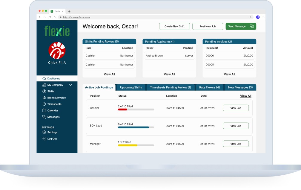
Unveling the Flexer's UI
We iterated on the Dashboard screen. We decided this was ideal because:
It's essential for the client and elaborated on details about the Flexer experience and an overview of what to expect on other pages.
The client didn't have a Flexer Dashboard developed.
Some components could keep consistency across the page.
I designed option 1, which the client selected as the final iteration. I got inspired by the brand's attributes, beta version, and previous phase's components.

Brand and mission alignment with the style guide
The style guide we created helped us understand how the high-fidelity screen would look and feel to the user, as well as the consistency all screens needed to have. The color palette associated with the UI, inspired by the mood board's predominant shades and established branding attributes that the client worked with in Phase 1.1. The font selected was Inter with different sizes based on the industry’s best practices for this product type. We prioritized an experience with a readable font to optimize accessibility.


The final strech: high-fidelity wireframes
In this process, I refined my work in previous medium fidelity wireframes with userflow 5, in which the user rates and reviews a company. Using the style guide, I honed the My Jobs page and rating and review process. The user accesses the page and selects a company from current, saved drafts, and previous tabs. Initially designed as part of the Dashboard, this tab was seamlessly integrated into this page to ensure consistency across the platform.

Finally, code-ready!
The developer handoff for the rating and review experience involves the following key points:
My Jobs Page: The tabs component includes different options in which the user selection changes color to white.
Questionnaire: Users complete a series of questions and assess criteria on a scale of 1-5. I made these interactive components in which selected state changes to the primary CTA color.
Written Review: Short answers asked to the user that needed a maximum of one-sentence answer. The written review has a word counter with a limit capacity of 500 characters.
Pop-Up Modal: After the export process, a toaster notification provides immediate feedback to confirm the successful export of the report.

Impact beyond lessons learned
Leading this project as a team lead has given me many insights and lessons that have significantly enhanced my approach to future projects. I've learned that having clear project objectives and ensuring everyone on the team thoroughly comprehends and aligns with these objectives is critical.
As a result of this project, Flexie received funding from 3 investors (Techstars, NC IDEA, and 1863 Ventures), received a video testimonial from the owner of several Chick-fil-A franchises (Rob Rogers), and successfully onboarded 8 new clients (including Kumon, 2ULaundry, and Harris Teeter). Relying on quantitative and qualitative data and analytics helps inform design choices, providing insights that intuition alone cannot. I suggested that the client incorporate Google Analytics into his MVP. This way, the client ensures that users respond according to his business goals and iterates accordingly in the subsequent phases.
